Monday, December 26, 2011

Here & Now: A View From Home

(To learn more about the "Viewfinder Project" see the original post.)

To the right of the computer is an Alvin Cutting Mat (for me this doubles as a mouse pad). Here I noticed the coordinates and measurements and realize my place. I am home.

Detail: Alvin Cutting Mat

Two "Viewfinders" that for me point to home are a house image by Pamela Delaura and a painting describing a map by Kariann Fuqua. Especially in the latter case, these images may not be directly connect to a sense of home. However, for me they have stirred a narrative. Images become transformed by what the viewer (in this case myself)  brings to the picture. Without the viewer's interpretation an image lacks meaning. In a similar way, home is a place but it is also a collection of ideas and is built on personal connections.

Pamela Delaura, Sacked, Collograph & screen-print, 6in. x 4 1/4in., 2006

The interior of Pamela Delaura's print (seen above) seems to refer to a microscopic or biological perspective. In this regard, I see the body as our most earthly home.

Kariann Fuqua, Viewfinder, painting, 6in. x 4 1/4in., 2006

Kariann's "Viewfinder" (seen above) refers to a map where the curving dotted lines seem to indicate travel or hopping from island to island. I wonder if one can land and feel at home or is this a temporary sensation? Gazing back at the coordinates on my cutting mat, I consider how I decide an exact position. I suspect that thinking we are in the right spot (even if this is our illusion) is more comforting then aimlessness.

Thursday, November 24, 2011

A View of Thanksgiving and Beyond

(To learn more about the "Viewfinder Project" see the original post.)

I never thought of the winter holiday season in relation to a lime green color. However, perhaps it is useful to envision the season in a broader way. Without allowing for alternative views, it is not possible to see life as having a full spectrum. When looking at Leslie Mutchler's "Viewfinder" (seen below) in the context of Thanksgiving, it is possible to envision a feast in the tropics. This is brought about through color but also because the food presented is all fruit. 


Leslie Mutchler, Viewfinder, mixed media collage, 4 1/4in. x 6in., 2006
Inpart because Jesus was Jewish, my thoughts of Christmas are intertwined with Judaism. Noah Simblist has created a series of abstract paintings that build from the Star of David. In the work he sent me (below), I feel like the star is becoming or being born. Again for me the lime color reflects life, growth, and a warmer climate. When Simblist and Mutchler made their "Viewfinders" I doubt they knew each other and they lived in separate parts of the country. Now they both spend there time in the heat of Austin, Texas. Indeed maybe there is something in the stars and why not a brighter green?
  
Noah Simblist, Viewfinder, Acrylic and Graphite, 6in. x 4 1/4in., 2006

Sunday, November 20, 2011

A Working View

(To learn more about the "Viewfinder Project" see the original post.)

Sometimes it is difficult to have a clear view or perspective. One's mind may be so clouded with thoughts and worries that it is hard to stop and see what is immediate in front of oneself. Relief from this overly stimulated mind may include meditation techniques which center a person in the present. Art making can also shift a persons attention toward specific tasks and away from an overwhelming sense. Creative endeavors can lead to a sense of satisfaction brought about through focus, change, and invention. The key is to be engaged and to work. When doubt is set aside the results can be surprising.

For me, the following "Viewfinders" reflect these artists' desire to work through problems in order to generate a less predetermined view. I say this because the layering of ink and paint in these examples point toward exploration rather than a succinct resolution. In the first two cases the work literally shows through to the other side of the paper.


Eric Huebsch, Viewfinder, mixed media, 6in x 4 1/4in, 2006

Eric Huebsch shows a deftness when drawing a figure wearing rollerblades but the neck and head appear out of control (above). Not only is the neck elongated but I observe at least seven layers of media are used to create this part (e.g. ink, paint, collage,...). At the bottom is the statement "I knew you were no good". Disturbing as this depiction may seems to be, I know some there is some "good". No matter how painful a subject may appear the act of making art ultimately is a construction and an imagined representation that can become a focal point for dialogue.


Rebecca Vicars, Viewfinder, 4 1/4in x 6in, 2006


In the image above, Rebecca Vicars creates a view of a lush world full of growth. The description of space is loose and the painterly approach gives it the sense of a swampy wetland. A sense of control is tenuous; watercolor is applied here to provide unpredictable results. There has to be trust by the artist that through a committed effort the picture will come into focus.


Jennifer Peters, Viewfinder, monoprint, 2006

Jennifer Peters Viewfinder combines relief printing with what appears to be a monotype technique. The relief print requires carving to make a matrix that produces the print. What is carved here is premeditated, in the sense that the shapes are clearly defined, but how the shapes come together is less certain to me. The yellow marking, would make the final image a monoprint, was layered last as if to add an exclamation point. It seems to beg the question of when and what is too much? However, doing enough work to get to a point where this question becomes relavent is paramount.

Sunday, November 13, 2011

Julie Mecoli: A View Toward The Shortest Day

(To learn more about the "Viewfinder Project" see the original post.)

The Winter Solstice will take place (Thursday December 22, 2011) in a little over a month. This has allowed me to consider the qualities of darkness and its psychological range. Darkness will often illicit fear because it obscures sight and represents the unknown. However, darkness also provides the critical function of allowing the eyes to rest. Any relationship with light is bound to darkness (In a broader philosophical way this is expressed in yin and yang). This can become apparent when people pray. Often one's eyes are closed, in this case putting oneself in darkness, in order to find an inner light.

Julie Mecoli's "Viewfinder" (seen below) presents darkness in a multifaceted way. It contains cultural references and a range of material applications.  She explained to me that this piece reveals a view from her bathroom window of a cathedral. Cathedrals were built to bring in light through stain glass windows and to present devinity through architecture. Ironically, light often casts the exterior of these buildings as a less colorful compared to the surroundings.


Julie Mecoli, Viewfinder, 4 1/4 inches x 6 inches, (Media: ink, photocopy, tape), 2006

Another element in Mecoli's "Viewfinder" is the portrait. In this case it is self-portraiture developed from observational drawings made using her bathroom mirror. Julie begins by making daily drawings on post-it notes. Then she photocopies them so that one portrait overlaps the next. This means that she feeds the same piece of paper through the copy machine multiple times. Thus, eventually the features of the figure begin to vanish into darkness. Julie told me that the copier can only take this procedure 10 times before it jams.

The layering process that occurs demonstrates how self observation can be intense and at times be destructive while also being a force for positive creative self realization. The portrait is but a representation of one side of ourselves and these portraits serve as reminder that we have a being and a likeness even in darkness.


Julie Mecoli, Dark Matter Gateway, 34cm x 16cm x 4cm, cast bitumen, 2009

Many of Mecoli's other works feature a contrast between dark and light including a series of sculptures cast in bitumen (an example is seen above). These sculptures slowly change form over time and serve as a reminder that no matter how solid a form or idea it is subject to change depending on the right conditions. Julie has also made a series of drawings and blog posts related to the rehabilitation of her hand (one is featured below). Several of her fingers were crushed in an accident. I am happy to report that Julie is on the mend but do check out her drawings and writing.

Julie Mecoli, 18 January 2010 Post therapy New device to Bend fingers not cooperating crushed hand + wire cube

Friday, November 4, 2011

About Order

Tonight I was putting away paperback books I am not likely to read soon. This is being done in an attempt to gain control of my living space. In the process of packing the books, I have found How to Organize Your Work and Your Life. Although I had this book for years, I never studied it thoroughly. The book appears worn and was eventually taped together. This makes me wonder about the people who used the book before me. Could it be that those that read the book were filled with good intentions about organizing there lives and could not meet the  suggested advice or is it worn because it was highly affective? In my case, this book has served as a symbol of the organizing I should do. It is also ironic because the function of putting the book away has made me more organized. However, ultimately I am bothered because I can not bring myself to make it disappear.

Sunday, October 30, 2011

A View of the World Unclothed

(To learn more about the "Viewfinder Project" see the original post.)

Rarely do most of us scrutinize a person's features beyond passing glances much less get a good look at a person unclothed. An essential aspect of drawing the figure from life is an intense study of form. Figure drawing is challenging in part because of judgements about proportions and shape. If the draftsman's observations are off, then the rendering will look less like the model. Figure drawing is also one of the few opportunities to see the human body in an unobscured or unmediated way. After one draws from the figure it becomes easier to imagine or invent figures based on this study.

Heyd Fontenot's "Viewfinder", Paul Sitting On His Feet, 6 by 4 1/4 inches, Ink, 2006


Heyd Fontenot and Brian Jermusyk present a view of life unclothed. However, their work transcends mere study. Both artists offer a commentary on the way we live and the way we choose to see ourselves. They also use a comic style that mixes seriousness with humor. Fontenot will often draw and paint the unclothed figure coupled with animal counterparts. He also emphasizes the relationship between facial expressions and pose revealing a range of raw emotions such as surprise, boredom, disgust, and ecstasy. In the image Hyde sent to me (seen above) the figure appears to turn his head to the viewer, with a coy knowing look, while shifting the body to emphasize his back. Like old Hollywood movies there is mystery; we think we know what is there but we can not see everything.


Brian Jermusyk,"Viewfinder", 4 1/4 by 6 inches, Graphite, 2006


Brian Jermusyk has worked on a series called The “T” Drawings which are informed and influenced by reading the published diaries of Kenneth Tynan. Jermusyk presents a complex view of the sexual being. Sex brings pleasure but attached are inevitable psychological and at times physical costs. Many of these drawings depict a seductive cycle of birth, life, and death all in the same image. When Jermusyk places these stages in close proximity a mixture of pain, pleasure, and anxiety feel palpable.

The drawing seen above seems to be a beginning piece to a narrative. This drawing appears to depict the curiosity found in recognizing another's form as sensual. Given connections both in terms of subject and approach to other drawings included in the "T" series, the assumed result of this encounter point toward a scene of a birth amidst a specter of death. Although the idea of death can not be separated from birth, the latter drawings mentioned serves as a reminder of how dangerous birthing has been (and still is in certain parts of the world) to both mother and child.

Tuesday, October 18, 2011

Steve Keister's View to the South and East

(To learn more about the "Viewfinder Project" see the original post.)

Recently, I finished reading the Hermann Hesse novel Journey to the East. There is an unassuming and mysterious character in this book named Leo. He turns out to be a person of utmost importance. Steve Keister reminded me a bit of this character. I worked with Steve for several years at Princeton University and I have always felt a certain balance and kindness about about him (his importance was always apparent to me).

Steve Keister grew up in "Amish Country" (Lancaster PA). However, I feel his view has been consistently directed beyond the local (I suspect in order to explore the larger world and see it in a personal way). Keister spent time in Rome as an undergraduate student and later completed his Master of Fine Art degree there as well. Since the late 1970's Keister's work has been inspired by a study of pre-Columbian artwork and he has made numerous trips to Mexico.


Steve Keister, Skull Plaque III, Ceramic, 2010

What is fascinating about Steve is how he is able to see possibilities and look outward not only in a geographic, and historical way, but also in a material way. I was amazed to learn that Steve started out as a painter, became a sculptor, and then a ceramist. These changes don't seem tentative, he set out for knowledge and a mastery.


Steve Keister, Viewfinder, 6 by 4 1/4 inches,  Paint on Paper, 2006  

One aspect I fine most compelling about Keister's work is how it skews a modernist time line of artistic advancement by pointing out cubist techniques often overlooked in the genius of earlier graphic and “craft” based works. Perhaps this ancient work did not get the attention it deserved because it's exaggerations and graphic nature often pointed to humor rather than an overt seriousness. A wry sense of humor is apparent in Steve's work. It is a subtle humor (without a punch line) related to the way one can see the world and choose to smile. It is the kind perspective one would imagine a Buddhist monk chuckling about. This leads me to believe (returning to my earlier connection with Hermann Hesse) that Steve Keister has also already made a “Journey to the East”.

For more about Steve Keister's work visit his website also take a look at information about his exhibit at the University of Pennsylvania.

Thursday, October 13, 2011

A View of the People by Shelley Spector

(To learn more about the "Viewfinder Project" see the original post.)

Shelley Spector's "Viewfinder" reminded me of the the Occupy Wall Street movement. It is about ordinary people joining to do something bigger than themselves. I was heartened to read an article in the L.A. Times about how the Occupy Wall Street protesters are generally unexcited about celebrities coming to the protest and making a spectacle. They are concerned that their message (broadly defining problems of income disparity) may be co-opted and used for personal gain. Because Spector's method appears direct she is able to create an image that feels like a spontaneous gathering and event comprised locals (similar to the assembly in New York). Hopefully, the Occupy Wall Street movement will be able to maintain a sense of independence and truly represent the people. This responsibility, much like the human tower depicted, is a tall order.


Shelley Spector, "Viewfinder", 6" x 4 1/4", 2006


For more information visit Shelly Spector's website. Shelley has also created a website called Art Jaw that fosters first hand accounts about the art community in Philadelphia.

Saturday, October 8, 2011

J. Todd Allison and Joe Moccia: Views From Another World

(To learn more about the "Viewfinder Project" see the original post.)

Since I was young, I have been interested in stories about how a distant world may come in contact with our everyday life. Recently, I read a book by Gary Lachman about the German spiritual leader and philosopher Rudolf Steiner. At a certain point in the biography Steiner receives hidden knowledge from a person identified as the "Master". One gets the feeling this mysterious person is either part fiction or comes from a different dimension. It has also been intriguing to hear a recent interview on NPR with physicist Brian Greene who discusses the possibility of parallel universes. Although Greene speaks about plausible science and does not indicate how parallel universes may interact, at the very least his discussion allowed me feel as if my intuition has some connection (if not distant) with concrete data. These visceral feelings are related to the way that art is able to revealed worlds that exist beyond our humdrum routines.


J. Todd Allison, "Viewfinder", 6" x 4 1/4", 2006


Both J. Todd Allison and Joe Moccia sent me "Viewfinders" that point to uncharted worlds. Allison's painting (seen above) seems to combine body organs with mechanical parts and what looks to me like a woodpecker. All of this occurs amidst floating bubbles and a blue background. I can't help but feel like this is an interior scene and this is a world within a larger body. In this regard, I thought of the 1966 film Fantastic Voyage. In this film individuals are miniaturized and travel through a human body.

Joe Moccia is a graphic designer who now works with motion graphics in the Washington D.C. area. However, when I was getting to know Joe he had an obsession with robots (he is also a bit of an inventor). His painting/ pen and ink drawing (seen below) seems to be an extension of his interest in science fiction. The strange cloud made with iridescent paint appears to be an alien life form or U.F.O. that can shift shape.


Joe Moccia, "Viewfinder", 6" x 4 1/4", 2006

Thursday, September 22, 2011

Viewfinders: Persistently Red

(To learn more about the "Viewfinder Project" see the original post.)

Kip Deeds, "Viewfinder", 6" x 4 1/4", 2005

After receiving "Viewfinders" from other artists, I began to think about the suggestive nature of the image initially sent out (seen above). The image sent was printed with two layers. First, a red was printed on white paper and then black was printed on top to provide detail. Given its saturation and contrast, the red had a powerful additive effect. I wondered if this choice influenced the recipients because much of the artwork returned was dominated by red. The approaches varied but the results were persistently on my mind.

Red is associated with dramatic appearances in nature (e.g as seen punctuated in the landscape in the form of flowers, as see in fleeting moments as the sun sets, in the details of a fire, or as blood when we are cut). Red has come to symbolize a sense of passion, vibrance, and at times danger.  Perhaps for this reason red is also associated with other temporal states such as when one blushes or when one is angry (one can "turn red" and one can "see red").

John J. O'Connor, "Viewfinder", 6" x 4 1/4", 2005

I can only guess at the system John J. O'Connor  used to devise his "viewfinder"(seen above). O'Connor often uses complex data and text to point out highly directed and individualized results. He attempts to visualize mass information using his own idiosyncratic methods. Through his process he creates an abstract picture that in its wholeness captures a transcendent image. 


Although John O'Connor's artistic labor is serious, there is also something humorous and ironic about it. When his work uses information of a more politically volatile nature, he seems to be making light of officials who use statistics in selective and less than credible ways. Regarding one of his recent works, John O'Connor states how he used the "largest rises and largest falls in the history of the stock market, connected according to my own invented system. I juxtaposed and connected this structure with statements of great confidence and insecurity, revealed through hypnosis."

Anne Stagg, "Viewfinder", 4 1/4" x 6", 2005

Anne Staggs's "Viewfinder"(seen above) refers to sewing and work stereotypically connected to women. However, Stagg's sewing is not exactly the kind one may expect, the act is not about fashion or decoration but more about keeping "it" together. On her website, when referring to a related series of paintings, Anne described her initial inspiration "comes from a chore that my sisters and I were given when we were young. In order to prolong the life of our socks, my mom asked us to repair the socks that were wearing thin. We stretched them over a bare light bulb and darned them with sock yarn." 


Stagg's paintings are unlike the "Femmages" (a kind of feminist collage using fabric) that Miriam Shapiro made in the 1970's. Even though there is a relationship, one has to look harder to see the fabric (what is there both literally and figuratively). The white in the image is also intriguing because it is not the fabric. The white is the unknown icy hot light. In this case the viewer is shielded (or protected) and stitched inside a red sock.

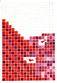
Jason Urban, "Viewfinder", 6" x 4 1/4", 2005

Jason Urban re-contextualizes commercial modes of production and often identifies imagery common in popular and mainstream culture seen through these modes. Urban gives prominence to the background content and details of reproduction processes (e.g. halftone patterns, screen savers, and raster images). By making the pixels more noticeable or by layering information in unpredictable ways (e.g. reproducing a screensaver image that is re-assembled on filing boxes) Jason allows us to consider what we usually overlook and see how this content can have new meanings. What I find compelling about the painting Urban returned to me (seen above) is that it appears unfinished. By recreating pixels by hand and by letting brush marks show, individual parts become prominent and interrupt a collective effect. In a digital realm, at the pixel level, this would be improbable if not impossible.

Taking the repetitious use of red further (and perhaps a bit outside of the realm of this project), I was reminded of the persistent use of the word "red" in the 1978 pop song "I See Red" by Split Enz.  Although the artwork I received did not make me hopping mad, the song offers a humorous comparison between lyric and music on one hand and visual art on the other hand. The underlying psychological impact of this color makes itself present in manifest ways.

Saturday, August 27, 2011

Billboards


This past spring I entered a contest where artists could submit designs for a billboard. There was a prescribed scale artists had to consider, but the was no limit on content.  I spent a weekend making three designs. My original idea was to make a very small print large and then offer commentary related to the imagery. Initially, I used rubber stamps (these I carved) to make small prints. After the prints were scanned, adjustments and additions were made in Adobe Illustrator.


Ultimately, my plans were rejected. However, I feel that the sayings and imagery offer something to consider.  Perhaps the traffic that passes through this site will give the billboard designs greater consideration than viewers might if they passed actual billboards by car. The design at the top depicts the age of the internet, but ironically it is made in a way that alludes to what is handmade and personal. The middle image reflects our habits and how they relate to one's desire to fit in. The bottom image follows the path of history and how information and vision have been passed from place to place. Of course each mode has it's advantage and disadvantage. 


Saturday, August 20, 2011

Christopher Davison: A View of Relief

(For more information about the "Viewfinder Project" click here.)

Several years ago I met Christopher Davison at his MFA exhibition in Philadelphia. After this exhibit, I invited Chris to make a “Viewfinder”. The drawing I received (seen below) led me to more questions than answers. Although illustrative, the image also seems somewhat atypical of Davison's work because it is relatively minimal and focuses on a single subject. The figure or form that Davison presents does not fit a neat characterization. Is it a depiction of a machine, is it a creature, or is it some tree or natural formation? It seems to be spouting out steam which initially caused me to make a mental leap to my memory of Old Faithful.


Christopher Davison's "Viewfinder", Size: 6" x 4 1/4, 2005

As my teaching position this summer came to a close, my sense of Christopher's drawing had evolved. I began to see his picture more specifically as a metaphor for a kind of exhale of relief. I feel that Davison's view is not so much of an object but more of an illustration of a feeling that transcends a complete description. No matter what job one has or what stresses life presents people need a means to “blow off steam”. This enables one to recharge or to heal. To “blow off steam” does not necessarily imply destructive or self-destructive acts, but it does indicate a limit and a change of course. In the case of individuals it indicates our physical and psychological limits.

In comparison to Davison's other works, he often uses layers of active drawing marks in a variety of media. Ultimately, this provides his drawings with a kind of psychic energy. For example, within many of these drawings figures that may not appear to be in motion may also appear to pulsate. In contrast to the "Viewfinder" (seen above) that provides an exhale,these drawings are like the energy one receives following the deep long breath. Below is an example from Christopher Davison's website.


Christopher Davison, Cronies, 11" x 15" · gouache on paper, 2011


Tuesday, July 26, 2011

Advert.

Here is a shameless advertisement.

Arkadelphia T-shirt

Detail

For prices and information contact: kipdeeds@gmail.com

Sunday, July 17, 2011

Summer Gift

This summer a friend and fellow artist Amy Long gave me a collection of canceled stamps. After organizing the stamps I found several unusual examples.  The cancellation mark in the stamp below seems perfectly placed to indicate the future direction of the characters. 


The most unlikely stamp I found in the collection (seen below) features
ermine (a kind of weasel) in a Christmas motif. Although this animal  has a white winter coat, it seems like a surprising choice for a holiday greeting.


Finding diverse stamps among the
given assortment  provided a welcomed diversion and a chance to imagine myself in other places among varied company.

Sunday, July 3, 2011

Eva Wylie: A View From The Ledge

(For more information about the "Viewfinder Project" click here.)

Eva Wylie's "Viewfinder"- Relief Print, String, and Book Board Ledge

Eva Wylie was the only artist who sent back a "Viewfinder" in parts as a sculptural project. She wrote to me saying that her work evolved through many stages including one that involved sewing. The end result is a shelf like display for a "Viewfinder" that she ultimately cut apart. Below is a descriptive drawing she sent as part of a letter.


For a long time Eva's shelf rested on my desk. However, it is this summer when I fully felt its relevance. While at a six week summer teaching job, I live in a cabin that has several simple shelves that allow me store necessities.  Below are two images from this cabin.


After considering these shelves, I realized that they function like a pedestal and a kind of three dimensional viewfinder. The ledge 
frames and organizes the image within a rectangle providing a context for the objects. Also, the conventional use of a shelf creates norms in which objects that are alike in either form or function are grouped together. Eva's small sculpture inspired me to consider how the everyday objects around me can be framed by conventions of three dimensional display. It seems that a shelf can be as powerful a prompt for organizing an image as the most traditional viewfinder.

Although Eva Wylie often uses print, sculpture, sewing, and installation in her artwork, her more involved projects usually build from many prints and break out of the rectangle or square. Below is an example from Wylie's website.


A detail of Eva Wylie's installation titled Roaring Garden

Sunday, June 12, 2011

Training the Eyes, Mind, and Body


Occasionally I see something particular or peculiar that may not make a great photograph and may not inspire a sculpture or a painting, but it does stir some thoughts. This occurred recently while out on my daily walk. In this case, I passed by a collection of exercise equipment in front of a house. It is rare to see such equipment (equivalent in quantity to that of a fitness center) out in front of a home. The objects were positioned in such away to form a jumbled overlapping unity.

Although the equipment looks like it is in disrepair, it is unclear if the machinery is headed for disposal. The equipment appears in limbo between the garage and curbside trash pickup. Not only is it a compelling menagerie of devices that seem to address every exercise craze and every part of the body, it also seems to beg to tell a story. Had the owner given up on exercise and banished the equipment? Is there a new device to replace all of the old equipment? Was the equipment bought on impulse, based on the allure of infomercials, and then left unused? Without knowing the owner of the equipment these questions can not be known. However, in a neighborhood where one residence usually merges with the next revealing only the smallest differences, this unique collection is a jolt and a reminder of our own (perhaps less visible) idiosyncrasies.

By taking a break from practical concerns and getting my own dose of exercise I was able to move beyond passive observation and to consider what I was seeing. The eyes, the mind, and the body were in concert thanks to the exercise equipment.

Thursday, May 26, 2011

Everywhere A View Is Found

(For more information about the "Viewfinder Project" click here.)

Last week I was in New York City and went gallery hopping. Toward the end of my visit in the gallery district of Chelsea, I noticed signage (seen below) for an exhibit titled Viewfinder at Artgate Gallery. Though I have been unable to find a statement about the exhibit online, I get the sense that the show has little to do with viewfinder devices. Rather, the title has to do with finding new talent through the Nars Foundation International Artists Residency Program. Although I took a nicely composed picture of the window displaying the exhibit announcement, complete with a reflection of the building across the street, I did not get many pictures of the exhibit (related images can be found in the links provided above).


Even though I know that my ideas are not completely original and feel that originality is finite, I felt something jarring about seeing an exhibit that also borrows the concept of a viewfinder. Am I just writing a series of reviews that present a view of specific artwork or can something conclusive be said about the way artists approach seeing and observation in the twenty-first century? Everywhere there is a potential view. So, what is important and how is this determined? Because I have many more "Viewfinders" to review, I wonder if it is inevitable that I will lose focus? Will I veer too far away from how a view is found and focus too heavily on what is in each unique picture?

Although I know that conclusions are inconclusive and I understand this paradox, I am still determined to make conclusions anyway. If one believes that the universe is an interrelated entity, then conclusions will also be beginnings. Thus, conclusions may be as relative to human interpretation as having an artistic view. However, it seems like it is the boundaries, both mentally and physically, that keeps us from drifting in a sea of random visions. Having a view is a first step toward an artistic conclusion. For me, as a writer, having thirty five to forty "Viewfinders" to review means taking a lot of small steps as I work toward a conclusion to this project. This leads me to know that patience is a requirement in gaining an insightful perspective.


Susanna Bluhm's "Viewfinder", Ink Drawing, 6" by 4 1/4"


The "Viewfinders" featured above and below tap into a kind of randomness. I did not give very many requirements for the "Viewfinders" I mailed out. In the case of the work featured here, I mailed out "Viewfinders" to two artists I knew who both live at the same address. I received back one of the drawings from an addressed artist and the other from an artist I had not solicited (this was fine with me). I suspect both "Viewfinders" were made at the same time and quickly as if they were made as a part of a game. I feel that this mode of working led to a spontaneity and playfulness that a traditional view finding device (the kind typically designed for art making) seems to psychologically inhibit.


Amy Lin's "Viewfinder", Ink Drawing, 6" by 4 1/4"


Two final notes: Susanna Bluhm has a wonderful website and will be exhibiting work at Michael Rosenthal gallery in San Fransisco. Lastly, in the note written on Amy Lin's drawing ("Winnie is a naughty dog"), Lin is ironically and humorously referring to Susanna's lovable pooch.

Sunday, May 15, 2011

Chad Andrews: The Daily View

(For more information about the "Viewfinder Project" click here.)

The "Viewfinder" made by Chad Andrews involves a layered reflective approach to daily events and is similar to other collage work he is currently involved with. Andrews begins by tracing over calendars. Then he draws on top of the tracing. Finally, the semitransparent paper is adhered to thicker paper that includes painted elements. The reality implied by the tracing along with the notes about everyday experiences meld with more abstract wanderings. It is as if Andrews is trying to say that everyday can be flexible and that there are guides but ultimately they are not fixed.

Chad Andrews artwork is an unfolding act and there is fluidity about his work from piece to piece. From 2001 through 2004, Andrews focused on meticulously rendered drawings of cardboard boxes that are juxtaposed with abstract marks and personal symbols. In the past couple of years, Andrews has also installed large scale dimensional drawings made of silicone that have the meandering line quality of a pen and ink sketch. In a certain regard the silicone drawings are unlike his work on paper. However, there are connections in terms of imagery and the continuous line of silicone seems akin to the ongoing connected days visualized in the schematic of a calendar.


Chad Andrews "View Finder", Size 4 1/4 inches by 6 inches.


Title: My second hand best Graphite and Gouache on Rives BFK - 8 inches by 16 inches 2009


Detail: Going to Philly (West Side)
Silicone Polymer - 8 feet by 32 feet
2009 - Installed: Eckhaus Gallery, Kutztown, PA

Chad Andrews lives on a farm outside of Williamsport, Pennsylvania and maintains a studio in the Pajama Factory in the heart of town. For more information and images visit the website of Chad Andrews. For more information about the Pajama Factory visit my post from last July.

Tuesday, April 26, 2011

Spring Travels

In March I flew to St. Louis and then in April I drove from Pennsylvania to Chicago. Between the St. Louis and Chicago trips I also visited New York and Philadelphia. Given this recent movement, I felt it would be worthwhile to organize and show some of the highlights.


Above is a print by St. Louis artists Gina Alvarez and Jana Harper. I was in St. Louis for the Southern Graphics Conference and Alvarez and Harper's collaborative print series was on exhibit at the Sheldon Art Gallery. The prints were inspired by a child's notebook of poems made by a relative of Alvarez. I found it fascinating to see how and when synergy occurred between the artists.


This April, I attended the opening of the Tyler School of Art alumni works on paper exhibit at the Crane Arts building in Philadelphia. The painting/drawing seen above by Mark Mahosky was created on segments of newspaper. Here parts of stories and captions show through the paint. This provides a compelling relationship between the ephemeral nature of the paper and the more permanent associations of painting. I enjoy the lumpy form of greys and muted colors that the painting creates. The lump and its
grungy associations in part reminded me of Philip Guston paintings.


As a part of the alumini exhibit Chris Golas created a performance where he draws himself out of a giant paper bag. The performance seemed at once fun, exhausting for the artist, and a daunting challenge. At its heart art is step by step and in a way if broken down into its elements it can seem simple. However, what worked about this installation/performance is that Golas was able to make the simple steps both grand and human. The artist brought vision, and energy to the process. Thus, transforming the simple steps into ideas and feelings that are complex and worthy of lengthy consideration.


Below Chris Golas makes his way out of the bag. Even while choosing a difficult bag, Golas proves, if one is willful, one will make it out of the bag.


Later in April I drove to Chicago. Here I saw the Jim Nutt exhibit at the Museum of Contemporary art. While taking a break at the museum, I noticed the wonderful stone garden (seen below) designed by Sol Lewitt. I enjoyed how either weather, people, or small animals displaced some of the stones making Sol Lewitt's complete system of vertical, horizontal, and diagonals a little bit imperfect.


Above is an early painting by Jim Nutt. Here I learned that he employed a technique used by graphic artists for pinball machines. Nutt would use a detailed sketch and place plexiglass over it. Then he would begin by painting details directly on the glass. Subsequently, he would layer the more general parts. Finally, the painted plexiglass would be mounted in a frame and the non-painted side would face outward.


The work above shows one of Nutt's later paintings. Through a video playing in the gallery, I learned that there was a lot left unseen in the exhibit because Jim Nutt often paints messages and images on the backs of the paintings. The work on the verso side tends to be addressed to the owners or handlers of the painting.


Although I visited New York City twice this spring, I did not take many pictures. A highlight from the first trip was a visit to the exhibit
Reconfiguring an African Icon: Odes to the Mask by Modern and Contemporary Artists from Three Continents at the Metropolitan Museum of Art. Above is an example of work by Romuald Hazoumé (Beninese, b. 1962. Ear Splitting, 1999. Plastic can, brush, speakers). These masks often present pathos and humor in a way similar to the inventive portraits by Jim Nutt.