Monday, December 28, 2015

Ellsworth Kelly (May 31, 1923 – December 27, 2015)

http://www.history.com/topics/ancient-history/the-egyptian-pyramids

The first time I saw Ellsworth Kelly's paintings/sculptures I was a high school student visiting Washington DC. The work was direct and palpable. To me the paintings seemed monolithic and akin to the blunt but elegant geometry of the Egyptian Pyramids. I did not know what to make of it. The fact that the work had an author seemed irrelevant. The name Ellsworth Kelly seemed fictional, like a symbol rather than a person I could know. Kelly Ellsworth seemed more accurate. While more informed, years later these feelings lingered. The exact meaning of the shape and color does not hide (there is little attempt at illusion). This caused a mix of pleasure and consternation. While I knew who made the work, color and purity does not have an author.

Now that Kelly has passed away, I am confronted with the question of whether biography matters? I learned that he served in the military and that he studied in Paris. I enjoyed seeing images of him and his studio (here is his New York Times obituary and a recent lecture). With this knowledge, he became a figure of greater depth. While I will never know Ellsworth Kelly personally, I will live with the shapes and colors he fashioned. Kelly's paintings and sculptures are built from math and precise chroma, but they are also breath. Since I only have pictures, It would be nice to go to Egypt and see if my analogy holds true. However, judging from afar I think there is room to make this connection.

Ellsworth Kelly, "Red Curve." 1986. Painted aluminum, 120" x 204" x 1/2" (304.8 x 518.2 x 1.3 cm)

Monday, October 12, 2015

For Better or Worse

When one teaches art in the "ivory tower" it shapes one's practice and when one survives as a gallery artist (one who principly makes a living on sales) this also shapes one's art. Expectations follow each pursuit. The answer to how the work gets shaped and what the work becomes is a bit less clear. Whether the goal is to be a little sharper, cleaner, or attention grabbing, the goal is to fit in (at least to the extent that an ongoing career is feasible). The context might shift but the psychology is the same. I feel that the impulse beyond the need to survive and make more falls under two branches. One branch is an existential drive (a primal need to build and keep the eyes and hands busy). The latter branch involves a spiritual impulse; this involves a determination to make an inner spark outwardly visible.

Over the past two years, I have been disconnected from teaching and from commercial aspirations. This has led me to question motives and to ask why continue? In a round about way, this question was given to me when I posted one of my recent pictures on Google+. A person I did not know asked (I think sincerely) why I had made the work. I said something to the effect of 'for the enjoyment of making it'. In this case, the artwork did not have to make sense or be pretty. It was something that I wanted to experience and see.

For the time being, there is no rush, no need to make lots of pictures, and no one is asking to hang artwork on a wall for others to see. Sometimes I glue paper to paper and keep at it out of an unexplainable need to keep moving. Other times I feel like I am tending a garden because sustanance and transendant connections can be found in the order of artmaking. For the better, I continue.

Work in progress, "Coat of Arms",  2015

Monday, June 29, 2015

Something New

For a number of years I traveled from Pennsylvania to Michigan. Several times I crossed part of Canada to get there. The first image I finished this month was an attempt to join the feelings and sense of friendships made through the time and space of this travel. The other image I worked on reacted to and built from a big stroke of leftover paint I had applied to paper. The fact that this bold green mark contained remnants of orange pigment gave me an opening to expand the palette elsewhere on the page. Suddenly new possibilities opened up. The artistic image is not a perfect window for the past. Rather it conjures up relationships and a direction for the future. While I can't be out on the open road at this time, I can begin to chart new vistas.

Title:Michigan Canada Crossing, Media: Watercolor, Ink, and Acrylic Paint, Size: 18" x 16 ¾"

Title: Grace, Media: Watercolor, Ink, Acrylic Paint, & Collage, Size: 18" x 7 ¼"

Sunday, April 26, 2015

Nature's Highlighter

forsythia_on_table
Forsythia On the Table

Forsythia may be one of nature's most potent highlighters. In the spring it is a saturated yellow. When not pruned, the shrub can spread like the lemon hue highlighting of a reader who deems nearly every sentence of a book important. The way the natural world blooms has a pace. So far, cherry trees have turned pink and then come the apple blossoms. When my father preceded my grandmother in death,  she planted an ornamental cherry tree as a memorial to his life. Each year I look forward to seeing the tree turn pink and watch for its growth.

I am amazed that a weighted plastic headstone placed in front of this cherry tree has survived fifteen years. Usually I find the plastic stone tilted on its side, but I make a point to return it to its proper standing. There seems to be more to highlighting than making marks. In order to retain meaning, there is a need to return to passages and recall important details. Reflection also makes color richer (i.e. both the hue and the vibrance of life). Colors that create an emphasis are more than pretty accents. They are temporary developments that shape spaces and offer anchors in a world that can feel like a complex web of light and shade.

As promised in the last post, included below are a crop of photographs.

forsythia
Forsythia


cherry_tree
Ornamental Cherry Tree

head_stone
Headstone in front of the cherry tree.


cherry_blossom
Cherry Blossoms


Friday, April 10, 2015

Threshold Between Notation and Notable

Leonardo da Vinci, Old Man and Water Studies, c. 1513

Lately, I have been thinking about how to maximizing visual exploration. When I was younger I felt I had more time to explore. How does one squeeze extra into less time? What kind of drawing best gets to the heart of a subject quickly and yields new insight? These questions caused me to think more about the thumbnail sketch.

As a student I dreaded thumbnail drawing and sensed many of my peers felt a similar way. These drawings often looked unsubstantial. It seemed to be about getting an idea out with little resolution. No matter how good the draftsman, I found the drawings fundamentally lacking. Even the masters most gestural drawings seem larger and more directed. This caused me to re-examine Leonardo da Vinci's drawings. I tried to find the more wobbly and expedient looking drawings. I was struck how he could focus on the action of phenomena such as the movement of water (shown above) as well as how he would doggedly pursue a subject (e.g. as seen in the studies for the Trivulzio Monument). Da Vinci's sketchbook becomes a symbol of monumental knowledge.

Leonardo da Vinci, Study for the Trivulzio Monument, c. 1508

Leonardo set a high bar for quality in a drawing journal. Perhaps for this reason, many of those artistically inclined have a drive to make the sketchbook an impressive object. The authority of the book as a form may give rise to the feeling that it must be filled in a spectacular way (leading viewers to continue to turn pages). For me this approach has been problematic. While the sketchbook is useful, it was not a format I wanted to invest a large amount of energy, and at times the thought of hundreds of blank pages felt like a trap.

Recently, I have been more devoted to digital drawing. It is appealing because elements can be shifted, re-arranged, and colors can be tested and altered while different versions may be saved. I enjoy the freedom this allows. However, I have found that the little tag sized drawings have a place. The thumbnail drawing does not require a book, special paper, or almost any other kind of barrier between the mind and hand.

One of the benefits of experience is that one is able to evolve past earlier biases. I held on to a prior assumption that thumbnails sketches were not colorful. Perhaps this is because color has a greater psychological connection with painting. Below are a collection of little drawings. While drawing quickly, here I labored in a way I had not previously. The marker became like a brush and in each drawing something new was discovered. While the discoveries did not seem monumental, my thinking was shifted, I found little surprises, and I was able to see potential. Perhaps this is like Leonardo's water study, at the time it was made his sketch may not have seemed like much. However, the drawing did lead Leonardo further down the river toward wider deeper currents.

Thumbnail Collection, 2015

Wednesday, April 1, 2015

In Like a Lion, Out Like a Lamb

March slipped by without posting, but I have been preoccupied. There was an exhibit in Philadelphia (reviewed By Chip Schwartz in Knight Arts). Many thumbnail drawings were accomplished (more on that soon). Much art was added to Pinterest (mostly sculpture and work by the Fauves). Through the ups and downs of March, I tried to stay calm waiting for warmth of Spring.


A few thumbnail sketches from March.

Looking forward to Spring.

Thursday, February 19, 2015

Homage to the Green Light

There is a light across the street from my house, and it is in such stark contrast to the other lights that it holds my attention. It provides a baring like that of the north star and a unique brilliance. At first I did not know that there was a literary connection between a green light and the sentiments (i.e. sense of longing and hope) that held sway over me. However, I was not surprised to find that a similar light is featured prominently in F. Scott Fitzgerald's The Great Gatsby and it has much the same impact. This is discussed on NPR's program Fresh Air with Terry Gross. In the segment How 'Gatsby' Went From A Moldering Flop To A Great American Novel, Gross illuminates the charged meaning of the light.

"The Green Light"


At 11 minutes and 56 seconds into the program Terry Gross states "one of the most famous things about The Great Gatsby is that Gatsby is always looking across Long Island Sound at the dock where Daisy lives. And he sees the green light that she has on at night on the dock. And he's always looking at that light and yearning for his dream - for her."

Gross makes it clear that a beacon can shine more than literal light. With a mind willing to venture to emotional realms, the light symbolizes the meditative place and connections needed to bring forth insight and far reaching speculation. Prior to my conscious knowledge of Fitzgerald's green light, I began to created my own homage to this emerald glow. This was an exercise not just to test out a range of greens but to call on feelings I did not yet have words for.

Kip Deeds, Homage to the Green Light, Watercolor, Ink, Acrylic Paint, and Collage


Friday, February 6, 2015

Facebook Art Challenge Part 5

The following are my offerings for the last day of the Facebook art challenge. Two of the works were created because I was tempted by a commercial for the Roto Zip. The commercial made it seem like you could cut shapes in wood as easy as cutting paper with scissors. Initially I wanted to cut shapes out of wood for relief prints. However, while at a residency, I became intrigued by the shapes of the scraps from my collage work. Putting the best scraps together, I decided to recreate them in wood. This is the only time I used the Roto Zip. However, I had many fun outings to Lowe's while making these sculptural paintings. 
I called the scraps "Stuffing" and the first work has this as the title. Also included is a work in progress view of Stuffing. The second image uses the the leftover shape from cutting out the "stuffing". It looked to me a bit like Great Britain and I had liked Billy Bragg's song "New England". I particularly liked the song because of the way he said "a new England" rather than "New England" (another place altogether). This is a simple but big difference. So my piece is titled A New England.
The last work shown here is a drawing/ painting where I use the shapes from Stuffing. It is titled Spring Training

Kip Deeds, Stuffing, 48"x 42"x 2 3/4", Acrylic & Collage On Wood, 2009

Kip Deeds, Stuffing as it was being built
Kip Deeds, A New England, 42"x 23"x 2", Acrylic & Collage On Wood, 2009
Kip Deeds, Spring Training, 16" x 12 1/4", Watercolor, Acrylic, ink, & Collage, 2009

Lastly, I nominated Marcus Howell for this challenge. Marcus and I hung out and made prints for three years at the University of Illinois 1998-2001. Marcus's work is often dark, but he is a skilled draftsman and printmaker who has a distinct perspective about social justice that he applies to his narrative work (also see Sue Coe). Those that are corrupt or suffer from vanity do not escape their moral short comings. Below I am pictured in front of one of his printed works.

Kip with Marcus Howell's artwork
Marcus Howell, Magical Apparition, Mixed Media Mono-print 


Tuesday, February 3, 2015

Facebook Art Challenge Part 4

(Note: The challenge required posting 3 images of artwork a day for five days and then nominating another artist to do the same.)

My Facebook art challenge day 4 featured characters I had either invented or developed in a unique way. Because I had documented two out of three of these figures previously on this blog, I will not repeat myself.  However, offered here are links to these posts featuring Mr. Wisor and Phil Poppin. Sophia (as seen below) was the last representative shown on day 4. A friend recently asked me about Sophia, and I replied: "With regard to Sophia, she is associated with wisdom and this was my grandmother's name. Also when reading about Sophia, I found that for those that do not understand wisdom Sophia takes on the appearance of a haggard old woman where as her beauty becomes more apparent for those who understand wisdom."

Kip Deeds, Sophia, Ink and Collage, 2014

Next, I nominated artist Walter Andersons for this art challenge. In 1997 I drove out to Chicago for the first time, Walter was among several people that saved me. I had very little planned. Walter, barely knowing me, spent a free day with me and took me around town in style. Below is a post card I have kept pinned to my bulletin board since 1999. The front features one of Walter's paintings. Andersons's art often features meticulous studies of photocopied source material (often art related images or text). This content is coupled with an abstract background. Here painting enlivens subject matter that, being derived from photocopies, are often several generations from its source. These images offer qualities and observations that are both reflective and altogether new. Included are two links to Walter's artwork, one site features paintings from the late 1990's and another presents more recent offerings.

Front (painting by Walter Andersons) and back of exhibition post card from 1999

Friday, January 30, 2015

Facebook Challenge Part 3

My Facebook art challenge day 3 featured performance art. This work was not made specifically to be exhibited. The drawing/painting/collage was made for the joy of seeing possibilities. The work presented here had holes cut in it, and the holes become planets, worlds, or vistas that can be seen as it is held up. I took the drawing outside, clowned around a little, and had pictures taken of me with it. Along with the planet drawing, is a ball of paint I have been building and liken it to making a planet. It is built like a snowball from my leftover acrylic paint. The last image here is likely what inspired the others. It is a print in a series of prints (all can be found on my website). It includes a circular etching made on a plate that Sharon Massey gave me. Who wouldn't want to make a circular etching if you were given a cut copper plate?

Below are the four images I posted for the challenge (I needed an extra image of me clowning around). 


As a part of the challenge, I next nominated Richard Barlow as well as metals artist Kit Burke-Smith. Although these artists have yet to take up the challenge, below is an image by Barlow and here is a link to a recent interview with Burke-Smith (Kit is also on Etsy).

Richard Barlow, 120" x 120", Media: sequins and latex, 2015

Wednesday, January 28, 2015

Facebook Challenge Part 2

Day two of my Facebook Art Challenge (post 3 images a day for 5 days) featured large collage works. Two of the works depict a boat I had named the Arkadelphia (named after a street I passed in Alabama, I later created a little story about it's history). After making the first image with a series of black and white printed portraits, I later wanted to try printing the figures in color and created the second image.
Kip Deeds, Moving Company, Collage Mounted on Canvas, 60" x 72", 2005

Kip Deeds, Poe Procession, Collage Mounted on Canvas, 46" x 61", 2009

The third image included was a portrait of Goethe after a sketch by Johann Heinrich Wilhelm Tischbein. I learned a lot making this image. Tischbein's drawing wonderfully captures Goethe in a private moment. It functions the way a sketch does best (i.e. getting to the essence quickly). However, when interpreting the image I had to decide wether or not to make corrections (I was not sketching). I fixed the perspective in the chair and in doing so I think the drawing lost some freshness and became more mechanical. That being said, all the other information I added created a new realm, one that I think Goethe would appreciate.
Kip Deeds, Goethe, Ink, Collage, and Relief Print on Canvas, 45" x 50", 2009

Next I nominated Rachel Welling to participate in this illustrious FB challenge (3 images a day for 5 days). I met Rachel at the Vermont Studio Center in 2003 and I am pleased to see her work grow and grow. Below is a sample of her work.
Rachel Welling, A Calling, ink and acrylic on paper, 17" X 11", 2011-2014

Saturday, January 24, 2015

Facebook Challenge Part 1

Artists on Facebook are challenging one another to post three images a day for five days. Artists are suppose to invite a new artist to post each day and they will follow the same rules. This is like the ice bucket challenge (i.e. peer pressure challenge) for artists. I will thank New Mexico based painter Scott Anderson and book artist Jeff Abshear (he is the director of the Kalamazoo Book Art Center), for this opportunity to plaster Facebook with odd pictures. At least I am assured they will enjoy my pictures and may be pleased that the challenge is alive outside Facebook. Also, one of the advantages of not being on Facebook is that I can curate my peers into this post. The following are examples by Anderson and Abshear:

Painting by Scott Anderson
Book Page by Jeff Abshear

The theme I chose for day on are "car" paintings. Specifically, the cars I have owned. Some say "you are your car". In other words here are three (or four) self portraits.
Kip Deeds, Self Portrait and Subaru, 2001
Kip Deeds, Self Identification, 2001
Kip Deeds. Passed By, 2009
As part of this challenge process, I chose Dawson Weber to next take part in this challenge. He is one of the few artists I know living in L.A. who also is a Midwesterner through and through. Go Dawson!

Dawson Weber, Study for Malagasy Notebooks (October, pp. 2-3), 2010

Sunday, January 18, 2015

Smorgasbord


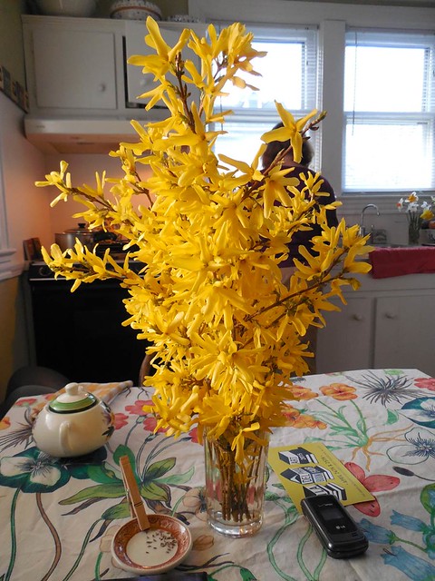
This photo of Miss Maud Swedish Smorgasbord Restaurant is courtesy of TripAdvisor

When I was young I would take trips to Reading, Pennsylvania with my parents (this was their hometown). Through out my childhood, these journeys were made to see relatives. Along the back roads I would take note of the landmarks (no tv in cars in those days). One such landmark was a restaurant advertising a smorgasbord. In my mind this conjured up an image of the most amazing spread of food. The somewhat exotic name "smorgasbord" gave me a sense that there was an ethnic connection between the foods. However, in reality the connections may have been minimal.

After posting about breaking records 2014, a certain amount of fear entered into my mind as 2015 approached. Could I live up to the high standards of 2014 and make 2015 even more special? I felt the need for a grand post to introduce this new year. Here I am attempting to offer a pictorial smorgasbord (i.e. variety with the hope of connections). I am seeking to recapture some of the experiences of 2014 and add something new.

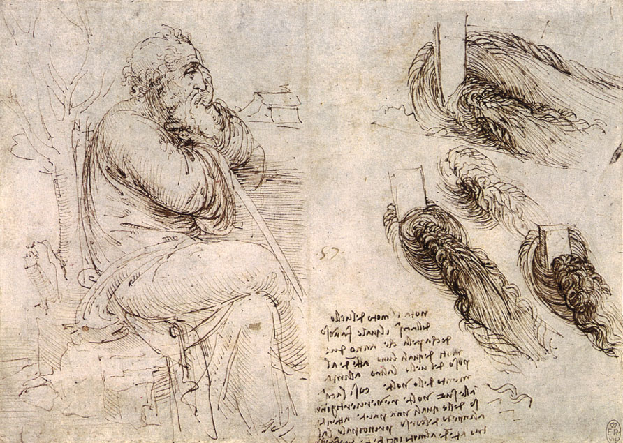
My first drawing started and finished in 2015

Perhaps today was a suitable day to look back. It rained all day, and so I stayed in and worked on a few drawings using adobe illustrator. First I tried to capture the mood of the day.

January 18th, 2015

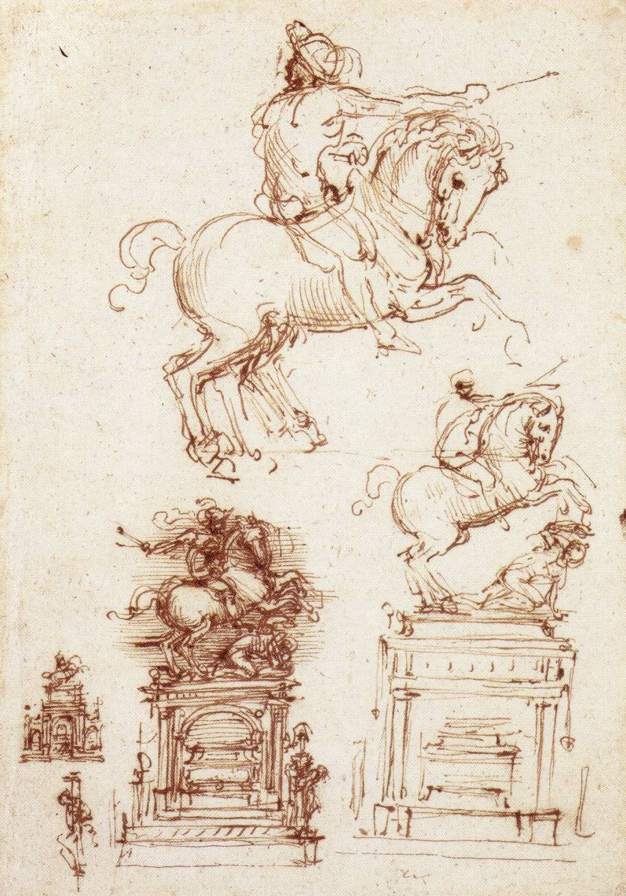
I also tried my hand at drawing a "recap" that represented 2014. Although I am am not fully satisfied or finished, I thought I would post the result so far.


Cap over cap, a recap.


One of the most enjoyable events in 2014 was a September trip to Detroit. At the time I had a print in an exhibit at Re:View Gallery in Detroit. Although I made a post about making this print, I never showed the finished result.

Detroit Diamond, Screen Print, 2014

On the way to Detroit, I stopped in Indiana, Pennsylvania and visited with metals artist Sharon Massey. Below is one of her sculptures.

Sharon Massey, Metals Sculpture from the Streetview Series

There is a gallery on the campus of Indiana University of Pennsylvania called the Kipp Gallery. Below I am pictured standing in front of it.


While I was pleased to see the prints by the other artists included in the group exhibit at Re:View Gallery, I was also thrilled that in the gallery's second exhibition space was a show by my friend and mentor Timothy Van Laar. Tim was one of my graduate school professors at the University of Illinois at Urbana-Champaign. While at UIUC, at the turn of the millennium, Tim was making small scale abstract paintings. I loved the way bits of color jumped out of these paintings. It was nice to see in this exhibit the continued sensitive but certain handling of paint and mark. While the paintings remained mysterious (answers are not given but the clues are numerous), content was introduced that feels personal and gives a sense of warmth. Below are several images from the exhibit.

Timothy Van Laar. Painting included in 2014 exhibit at Re:View Gallery

Timothy Van Laar. Painting included in 2014 exhibit at Re:View Gallery

On the return trip from Detroit I had the chance to visit Chad Andrews. Chad is artist friend who lives in Williamsport, Pennsylvania. Andrews makes prints but his work also stretches into painting and sculptural drawings. Below is a view of six of his "Black Cat" drawings in progress at his studio in the Pajama Factory building.

Chad Andrews: "Black Cat" drawings in his studio.

After such an event filled break, I was sad to return home. Now that it is January, I also miss the colors, warmth, and smells of late summer/early fall. Below is an image from Hanna Farm where Chad and his family live. I have to sigh a bit here but I am full. Although I could not pack all of my experiences from the Detroit trip into this post, at least for me, the smorgasbord idea worked.

Hanna Farm, Near Williamsport PA.